
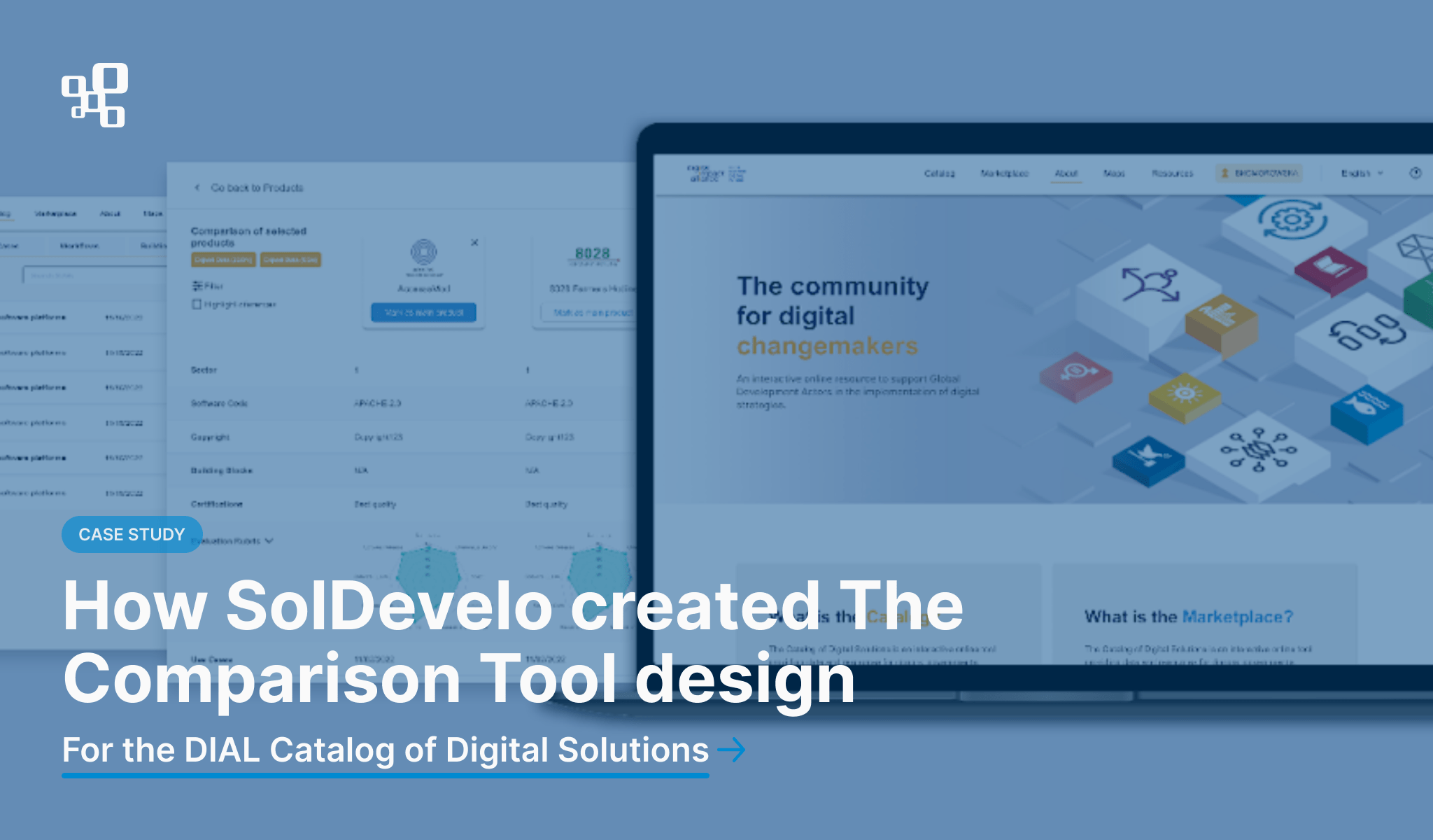

The main goal of the project was to create new designs for DIAL Catalog of Digital Solutions – a tool designed to support governments, donors, and non-governmental organizations (NGOs) in the discovery, selection, and evaluation of software products that have been developed to address the Sustainable Development Goals (SDGs). We’ve already shared a case study on this topic as well as an article dealing with more technical aspects of the project. If you’re interested to gain fuller understanding of our collaboration with DIAL, we invite you to read the blog posts mentioned above.
In this article we will focus on the UI/UX designer perspective. The project involved creating designs for the following three market features: vendor storefronts, RFP opportunity radar, and a product comparison tool.
Authors: Beata Komorowska, Beata Zwidryn
The main components of the DIAL Catalog project scope:
- Refreshment and restructuring of the layout of the Catalog
The Catalog has been divided into two parts. The three new functionalities (Storefronts, RFPs, and Products with the Comparison Tool) have been moved to a new space called “Marketplace.”
- Design of a new landing page for the Catalog
The landing page introduces both the Catalog and Marketplace features.
It contains guidance for less advanced users and explains all the functionality and possibilities that the DIAL Catalog provides.
- Creation and design of a storefront feature
Its main function is to let the organization owner display their portfolio more elaborately by adding more sections, motivating the page owner to improve the page, and highlighting the information better. The storefronts consist of fourteen editable sections that allow organizations to present their activities in detail. In addition, there is an option to create a new vendor storefront in the storefronts list view.
- Creation and design of a request for proposal (“RFP”) radar opportunities feature on the Catalog that focuses on offers from the governors/donors so they can post an offer on a specific solution with the possibility of applying.
- Creation and design of a product comparison and evaluation rubric tool that allows all users to view products and compare them based on multiple parameters.
- Creation of a style guide in Figma that would include all the mockups, interactivity descriptions with examples, components library, color palette, and typography of the Catalog for both designers and developers.
Comparison Tool Features process creation
This article will focus on the functionality we created from scratch – The Comparison Tool. Our goal in developing this tool was to give users as much freedom as possible to navigate through the tool’s functions without limiting previously available features. It had to be intuitive and easy to use.
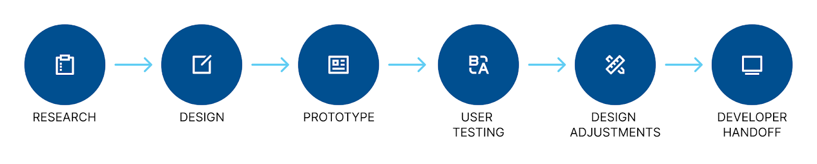
The project was carried out according to the following process:
- Research – conduct relevant discussions with clients to meet the business’s requirements and get to know users’ needs. This phase is also about analyzing the market.
- Design – this phase includes creating personas (representations of a user’s profile), brainstorming all the ideas, sketching the first ideas on a piece of paper, and making the first wireframes in Figma.
- Prototype – the result of the previous stage is to create a prototype version of the project to help users understand how the website will work and provide a sample user flow.
- User testing – combining all the previous phases leads to creating the clickable version of the project and handing it over to users to test it and get feedback.
- Design adjustments – this phase consists of taking into account gathered feedback – that is, making appropriate changes to the mockups and sending them back for re-approval.
- Developer handoff – once everything is accepted, the final stage is to create a style guide and hand over all the necessary documentation to the client.
Visual representation of the process:
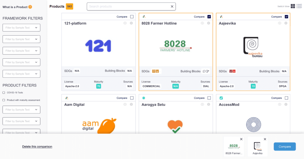
The creation of a “compare” button on the products tile and list view
The user should be able to select the products to compare directly from the main “Product” page. An important issue, which also had to be taken into account at the stage of designing the button, was its location on the product tile. We were using the current layout, so the button needed to be intelligible, not take up a lot of space, look well among the many symbols used on the product tile, and match the layout in the product list view.
After many discussions and research, the outcome was a checkbox with “compare” text next to it. In addition, the effect of adding a product to comparison has been enhanced by an orange border around the product tile.

A simplified version of the tile view, the “Compare” column with a checkbox, was added in the list view.

Adding products – user flow
- The first step in the comparison process is to select all the products we want to compare – the user can compare a maximum of four products.
- When the first product is added, an information that at least two products must be added to run the comparison tool is displayed.
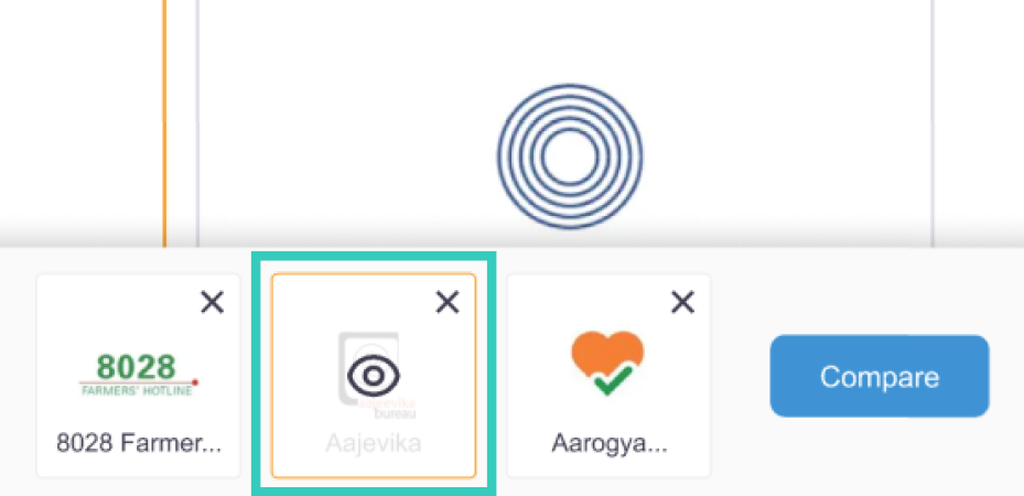
- When one product is added to the comparison engine, a bar will appear at the bottom of the screen with information on which product has been added.
- The user can leave the comparison mode by deleting the products from the comparison toolbar or by clicking the “Delete the comparison” link on the left.
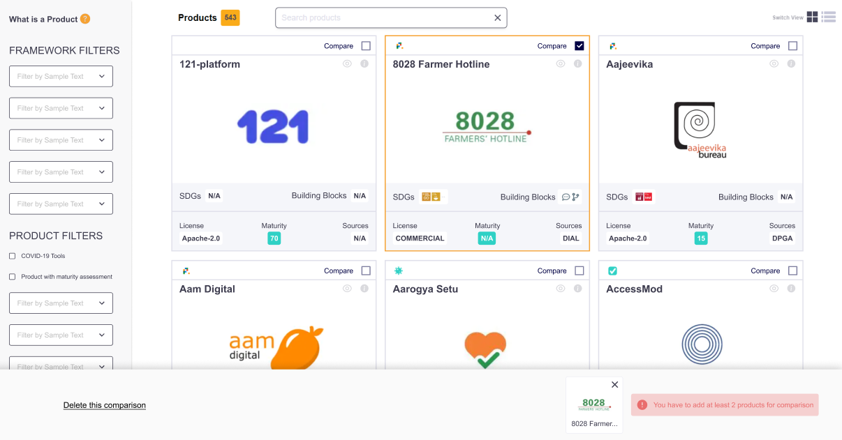
- The “Compare” button will appear when we add more than one product, allowing users to view the details.
- The maximum number of products that can be added to the comparison is four. When the user wants to add a fifth product, a message is displayed as on the following screen:

Preview products feature
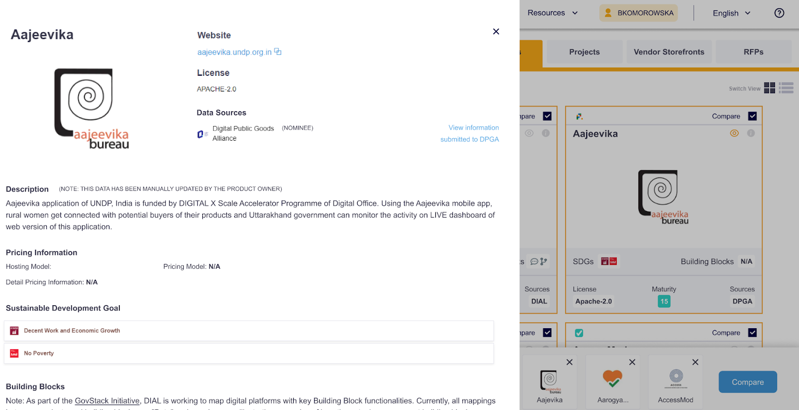
The user can preview the details of a particular product. Thus, the user can preview basic product information by clicking on the “eye” on both the tile and the list view. Once the “eye” icon is clicked, an overlay appears on the screen’s left side, which the user can close – by clicking on the background or the “X” located in the upper right corner of this overlay.

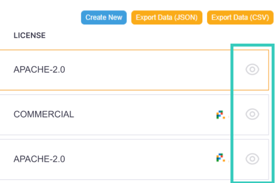
The “eye” icon has also been placed on the bottom bar – after hovering over the product logo, the eye appears and works in the same way as mentioned above.
Comparison Tool page
Based on the users’ research, the following needs were specified:
- Possibility to display only selected parameters;
- Selecting the main product that the rest of the products can be compared to;
- Showcasing the differences between the products;
- The evaluation rubric for each product should be displayed;
- Possibility of exporting results;
- An option to access the product details directly from the comparison tool.
Once the user has selected the four products they want to compare, they can click on the “Compare” button at the bottom bar to access the comparison tool.
The comparison tool is divided into two sections. On the left sidebar, the user will find a section with buttons where they can perform various actions, such as:
- exporting a comparison;
- filtering parameters;
- highlighting differences in parameters.
The second part (on the right) is a list of products selected for comparison, along with their parameters based on which the comparison is made. The product windows (right section at the top) and the left bar have fixed positions. This means that scrolling is enabled only inside the column rows. This helps the user track the details assigned to a specific parameter and product.
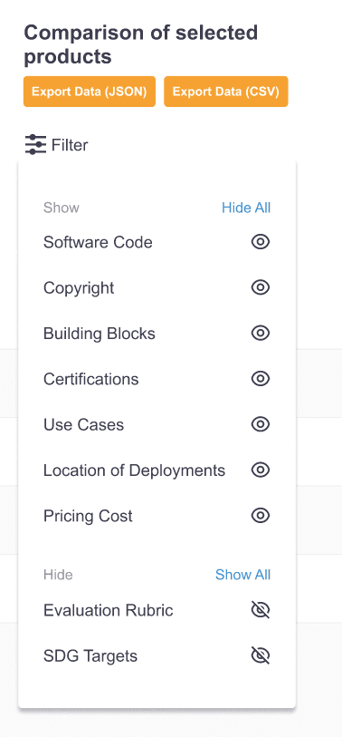
Filters
Based on the list of parameters provided by the client, the comparison table was created. We decided to add filters to allow users to choose which parameters to display. The user can hide the parameters that do not interest them by clicking on the “filters” button in the upper left corner and unchecking them in the “show” section. The unchecked parameter will appear at the bottom in the “hidden” section, and the list will immediately be changed according to selected filters.
Highlighting product differences
Below the filter button is a checkbox with the option to highlight differences, which will highlight in blue all differences in the parameters.
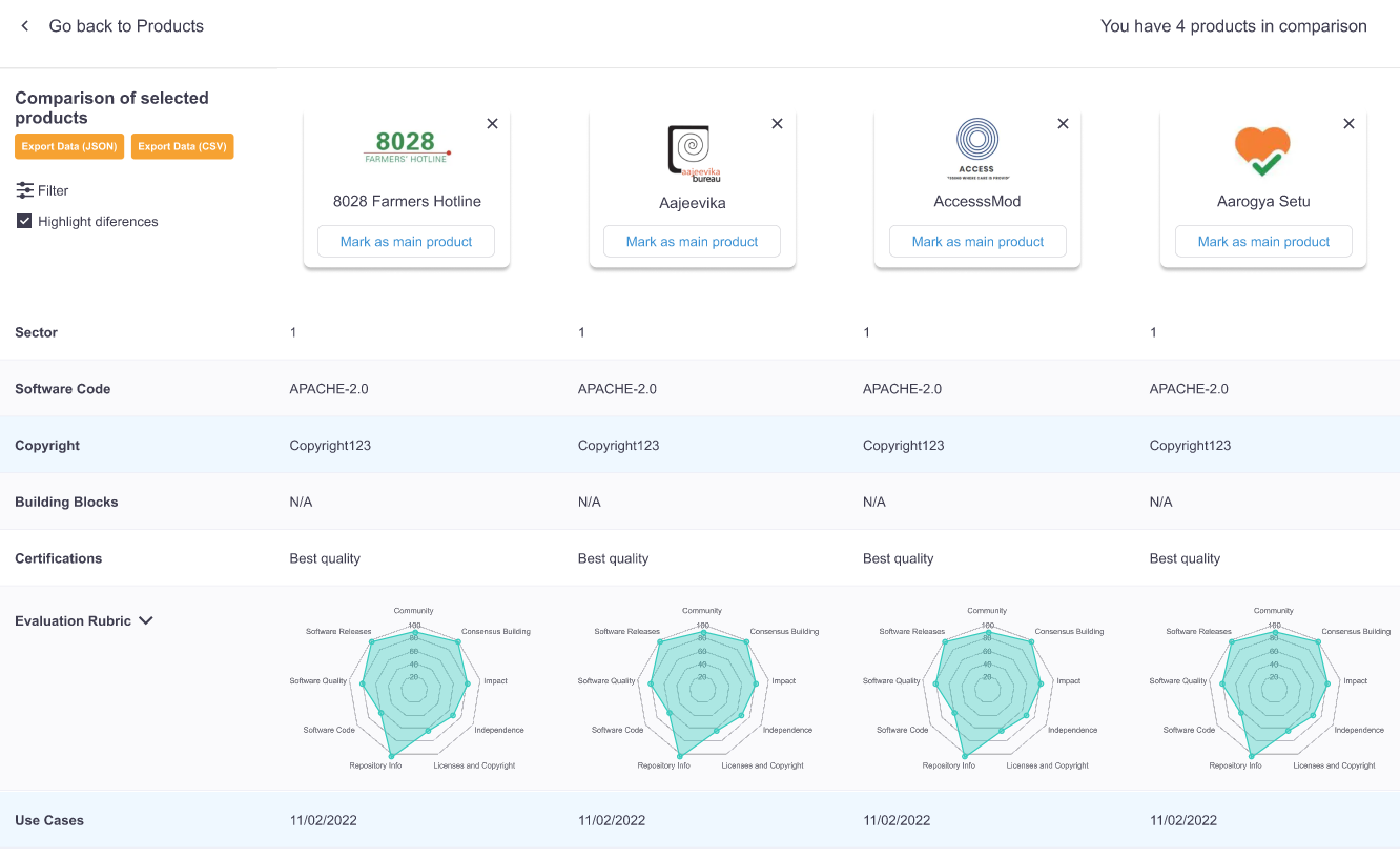
Maturity score
In addition, an important issue for the client was the inclusion of a chart with an overall maturity score. We decided to place this diagram directly in the table – so that users can also compare products on this basis directly in the comparison table view. The user can also enlarge it – clicking on it opens an overlay with an expanded view of the diagram. It is also possible to expand the detailed parameters of the maturity level by clicking on the arrow next to the “evaluation rubric” parameter on the left side.

Main product selection
The user can also select a main product and, based on it, rate the other products selected for comparison. The user must click the “Mark as main product” button next to each product’s logo at the top of the comparison table. It will appear on the left side of the table. Selecting another product as the main one will result in moving it to the left side and deselecting the previously selected product.
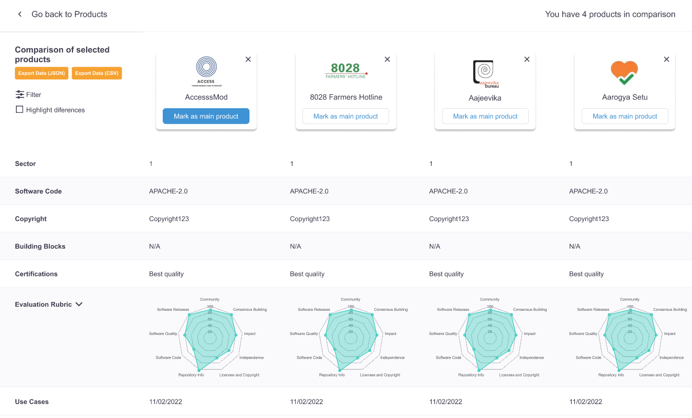
In addition to the functions described above, the user has the option to remove products from the comparison tool using the “X” icon located next to each logo, the option to preview the product description (after hovering over the logo, an eye is displayed, which, when clicked on, works in the same way as described above – that is, it opens a window on the left side of the screen) and the option to return to the product list view.
Video of how the comparing functionality works:
Conclusions
The DIAL Catalog project was interesting in many ways. On the one hand, we worked on the already existing layout and brand guidelines; on the other hand, we had a lot of freedom to create the comparison tool itself. Weekly meetings with the client allowed us to understand their vision for each functionality better. We had time to discuss any questionable issues and immediately implement solutions to move forward with creating new functionalities. The project was very engaging in terms of user experience; during an in-depth session with users, we were able to discuss any doubtful issues, ask users questions and clear up any doubts about the solutions used, which was very valuable for creating the final version of the project.